Chapter 12 R Packages for EMA Research
Many R packages exist that can help you in the management and analysis of EMA data. In this chapter, a selection of these packages is discussed. For each, we provide a summary description, example code, and pointers to further documentation, to give you a head start in using these packages for your work.
| Category | Package | Description |
|---|---|---|
| Actigraphy | GENEAread | Import GENEActiv data. |
| GGIR | Import, pre-process and analyze accelerometer data. | |
| PhysicalActivity | Analyze Actigraph accelerometer data. | |
| Data Management & Visual Exploration | dplyr | Data transformation. |
| ggplot2 | Create graphs. | |
| haven | Import and export SPSS data files. | |
| lubridate | Manipulate date and time variables. | |
| Auto-regressive modeling | autovarCore | Automate the construction of vector autoregressive models. |
| Mixed-effects Modeling | lme4 | Fit linear and nonlinear mixed-effects models. Fast alternative to package nlme. |
| nlme | Fit linear and nonlinear mixed effects models. Pre-dates package lme4, but is still used because it a provides advanced options to model correlational structures |
|
| Simulation | simr | Simulation-based power calculations for mixed models. |
| simstudy | Simulate complex study data. | |
| Symptom Networks | bootnet | Assess the stability of symptom networks. |
| qgraph | Estimate and plot symptom networks. | |
| Time series analysis | lomb | Calculate the Lomb-Scargle Periodogram for unevenly sampled time series. |
12.1 Actigraphy
Accelerometer data need considerable pre-processing before final analyses can be run. Raw data have to be read in from a variety of brand-specific file formats, data have to re-calibrated on a per-device basis, non-wear periods have to detected, and summarizing measures, such as activity counts and energy-expenditure measures, have to be calculated from imputed triangular (x, y, x) data, often in several time windows (i.e., epochs).
12.1.1 GENEAread
GENEActiv is a wrist-worn accelerometer that is widely used in sleep and physical activity research. With package GENEAread (Fang, Langford, & Sweetland, 2018), raw GENEActiv binary files can be imported into R for further processing, as illustrated below.
# Read raw GENEActiv data.
library(GENEAread)
dat <- read.bin(system.file("binfile/TESTfile.bin", package = "GENEAread"),
                  verbose = FALSE, downsample = 20)
d <- as.data.frame(dat$data.out)
d$timestamp <- as.POSIXct(d$timestamp, origin = "1970-01-01", tz = "UTC")
d[1:4, ]| timestamp | x | y | z | light | button | temperature |
|---|---|---|---|---|---|---|
| 2012-05-23 16:47:50.0 | 0.023516 | -0.887283 | -0.100785 | 0 | 0 | 25.8 |
| 2012-05-23 16:47:50.2 | 0.027462 | -0.933668 | -0.140047 | 0 | 0 | 25.8 |
| 2012-05-23 16:47:50.4 | 0.035354 | -1.150135 | -0.030114 | 0 | 0 | 25.8 |
| 2012-05-23 16:47:50.5 | 0.070865 | -3.229764 | -0.619042 | 0 | 0 | 25.8 |
By having access to the raw data, you are free to explore the data further in any you want. For instance, to plot the raw data captured by each sensor, type:
# Plot raw GENEActiv data, with ggplot
library(ggplot2); library(tidyr)
d <- gather(d, key = "sensor", value = "value", -timestamp)
ggplot(d, aes(x = timestamp, y = value)) +
  geom_line() +
  facet_wrap(~sensor, scales = "free_y")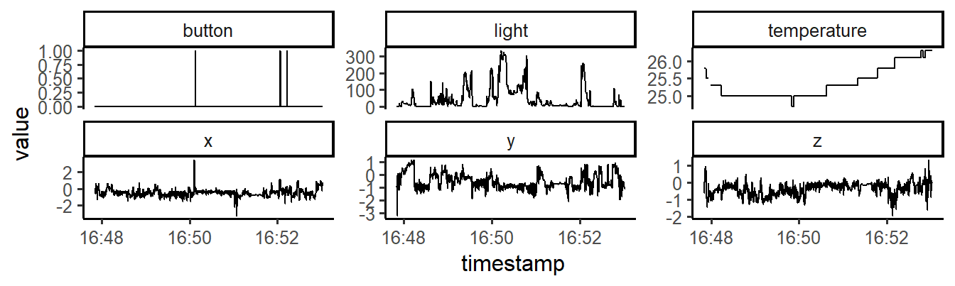
Figure 12.1: Raw sensor data of a GENEActiv accelerometer.
12.1.2 GGIR
Package GGIR (Van Hees et al., 2018) is a package to pre-process raw accelerometry data from three accelerometer brands: ActiGraph, Axivity, and GENEActiv (GGIR includes package GENEAread). The package is in active development. New features are introduced and bugs are fixed on a regular basis. If you consider to use GGIR for your project, you may want to install the development version, which is on GitHub.
library(devtools)
install_github("wadpac/GGIR", dependencies = TRUE)GGIR’s main function is g.shell.GGIR, with which multiple accelerometer data files can be imported, calibrated, cleaned (identify non-wear periods, impute data) and analyzed (extract and summarize variables on physical activity and sleep). The example below shows an example configuration (. See ?g.shell.GGIR (and ?g.part1, ?g.part2, to g.part4) to learn the meaning of each parameter. If you get lost or run into a problem, you can ask the package developers or other users for help via the GGIR Google discussion forum, at https://groups.google.com/forum/#!forum/rpackageggir.
# Import actigraphy data with GGIR
library(GGIR)

g.shell.GGIR(
  # Shell configuration ---------------------------
  mode = c(1, 2, 3, 4), f1 = 2,
  datadir = "./data/raw/actigraphy/",
  outputdir = "./data/cleaned/ggir",
  desiredtz = "Europe/Amsterdam",
  do.report = c(2, 4), visualreport = TRUE,
  overwrite = TRUE,
  # Part 1: import, calibrate, extract features ----
  do.anglez=TRUE,
  # Part 2: impute and summarize -------------------
  strategy = 1, maxdur = 8,
  hrs.del.start = 0, hrs.del.end = 0,
  includedaycrit = 10, mvpathreshold = c(125),
  # Part 3: Sleep detection
  timethreshold = c(5), anglethreshold = 5,
  ignorenonwear = TRUE,
  # Part 4: sleep summaries ------------------------
  includenightcrit = 12,
)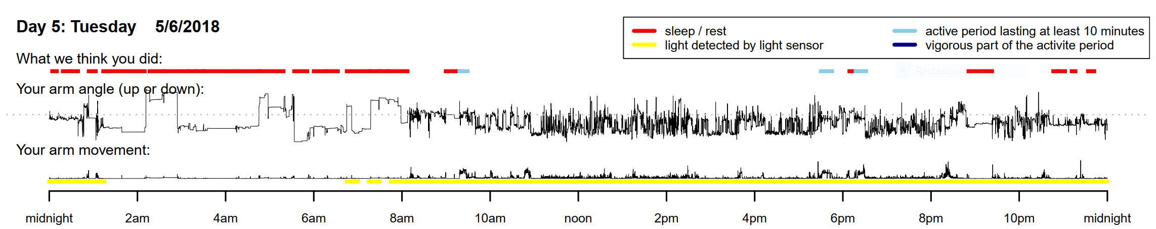
Figure 12.2: sample GGIR output
12.1.3 PhysicalActivity
Package PhysicalActivity (Choi, Beck, Liu, Matthews, & Buchowski, 2018) provides an alternative to packages GGIR and GENEAread, when ActiGraph data are available.
# Plotting activity counts.
library(PhysicalActivity)
library(ggplot2)

data(dataSec)

d <- dataCollapser(dataSec, TS = "TimeStamp", col = "counts", by = 300)

ggplot(d, aes(x = as.POSIXct(TimeStamp), y = counts)) +
  geom_line(size = .5, alpha = .5) +
  xlab("Time") + ylab("Activity Counts")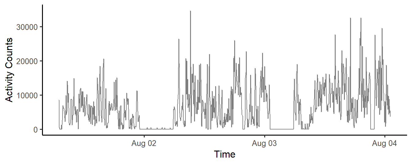
Figure 12.3: Activity Counts (5-minute windows), in a Three-day Accelerometer data set.
12.2 Autoregressive modeling
12.2.1 autovarCore
Vector autoregressive (VAR) models can be used to detect lagged relationships between multiple time-series (see also Chapter 7). In VAR, each variable is modeled as a linear function of past values (lags) of itself and of present and past values of other variables. When EMA is used to capture multiple phenomena over time, VAR can provide insight in how these phenomena interact. One challenge in VAR modeling is that many alternative models potentially exist, Package autovarCore (Emerencia, 2018) was developed to help researchers to find the VAR model with the best fit to a given time-series data set. In the example below, function autovar is used to detect that changes in depression are positively related to past (lag 1) values of activity, in a simulated data set:
# Autovar analysis.
library(autovarCore)

# simulate data
N = 100
depression <- rnorm(N)
activity <- rnorm(N)
activity_lag1 <- c(NA, activity[1:(N -1)])

depression <- depression + 0.5 * activity_lag1
d <- data.frame(depression, activity)

models_found <- autovarCore::autovar(d, selected_column_names = c('activity', 'depression'))

# Show details for the best model found
summary(models_found[[1]]$varest$varresult$depression)
#>
#> Call:
#> lm(formula = y ~ -1 + ., data = datamat)
#>
#> Residuals:
#>     Min      1Q  Median      3Q     Max
#> -2.2123 -0.6768  0.1725  0.6794  2.9461
#>
#> Coefficients:
#>               Estimate Std. Error t value Pr(>|t|)
#> activity.l1    0.50289    0.11166   4.504 1.88e-05 ***
#> depression.l1 -0.05937    0.09256  -0.641    0.523
#> const         -0.03508    0.10690  -0.328    0.744
#> ---
#> Signif. codes:  0 '***' 0.001 '**' 0.01 '*' 0.05 '.' 0.1 ' ' 1
#>
#> Residual standard error: 1.046 on 96 degrees of freedom
#> Multiple R-squared:  0.1776, Adjusted R-squared:  0.1605
#> F-statistic: 10.37 on 2 and 96 DF,  p-value: 8.384e-05
AutovarCore is a simplified version of a more extensive package autovar (Emerencia, 2018), which was used in several publications (Emerencia et al., 2016; Van der Krieke et al., 2015). Further information can be found on http://autovar.nl and http://autovarcore.nl
12.3 Data management & Visual Exploration
The tidyverse is a collection of well-designed packages, authored by the team behind RStudio, that together add a consistent, modern, and efficient extension of base R functions. The tidyverse includes popular packages such as ggplot2 (for plotting), haven (to read SPSS files), dplyr (for data manipulation), and many more (see: http://tidyverse.org for a full list).
12.3.1 dplyr
Package dplyr (Wickham, François, Henry, & Müller, 2018) implements the ‘split-apply-combine’-strategy. With dplyr, elementary data manipulations can be e chained (using the pipe operator %\>%) to elegantly implement complex data transformations.
# Aggregate data by ID, through a 'pipe'.
require(dplyr)

d <- data.frame(
  id = factor(rep(1:5, each = 10)),
  score = rnorm(50)
)

b <- as_tibble(d) %>%
  group_by(id) %>%
  summarize(mean = mean(score))

knitr::kable(b)| id | mean |
|---|---|
| 1 | 0.0151337 |
| 2 | -0.3329648 |
| 3 | 0.7150186 |
| 4 | -0.0570848 |
| 5 | 0.2506864 |
A good introduction to dplyr can be found in the book ‘R for Data Science’ (Wickham & Grolemund, 2016), which can be freely accessed online (http://r4ds.had.co.nz/).
12.3.2 ggplot2
Package ggplot2 (Wickham, 2016) provides a collection of high-level plotting commands with which graphs can be build up in layers. It is based on ‘The Grammar of Graphics’ (Wilkinson, 2006), an influential analysis of the structure of scientific graphs. Systematic introductions are available on the the tidyverse website, and in the book ‘ggplot2: Elegant Graphics for Data Analysis’ (Wickham, 2016).
The example below illustrates how graphs are layered. In the first step, a coordinate system is set up. In step 2, all time/scores points are plotted. In step 3, a smoothed line is fitted through these points. Finally, in step 4, the graph is split on a variable ID (a subject identifier), to show individual trajectories.
# Simple ggplot example.
library(ggplot2)

# simulate example data
d = data.frame(
  ID    = rep(1:4, each = 25),
  time  = rep(1:25, 4),
  score = rnorm(100, 0, 2))

# step 1: initialise the coordinate system
g <- ggplot(d, aes(x = time, y = score)); g

# step 2: add scatterplot
g <- g + geom_point(); g

# step 3: add a smoothed line
g <- g + geom_smooth(method = "loess"); g

# step 4: split plot by subject ID
g + facet_wrap(~ ID)
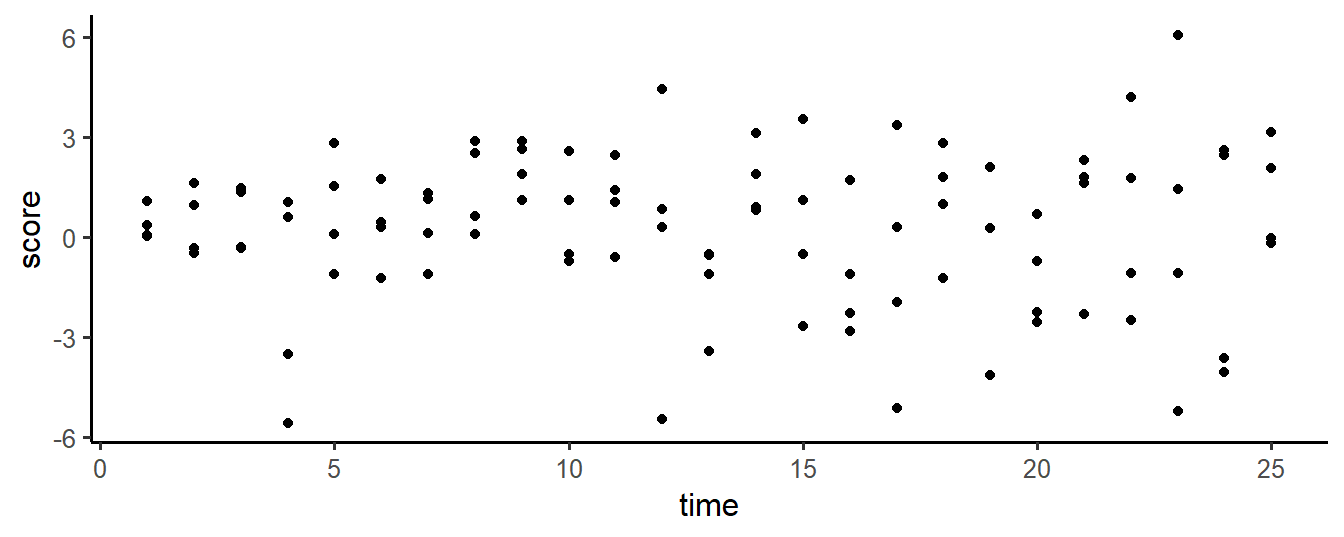
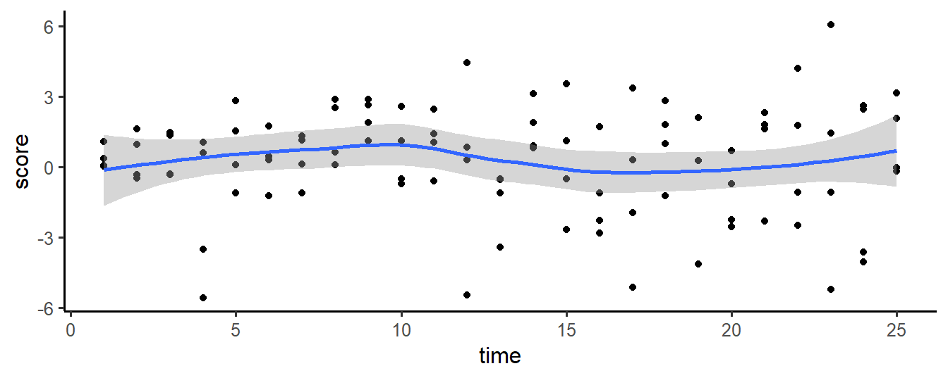
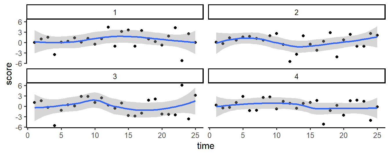
Figure 12.4: Plotting layers with ggplot2
12.3.3 haven
With package haven (Wickham & Miller, 2018), SPSS, STATA and SAS files can be read into R. A particular advantage of the read.sav function is that SPSS variables definitions are retained (in attributes of the columns in the R data.frames).
# Read SPSS data
library(haven)

# read example data (included in package)
path <- system.file("examples", "iris.sav", package = "haven")
d <- read_sav(path)

# show attributes of variable
attributes(d$Species)
#> $format.spss
#> [1] "F8.0"
#>
#> $class
#> [1] "labelled"
#>
#> $labels
#>     setosa versicolor  virginica
#>          1          2          3
12.3.4 lubridate
EMA data analyses frequently require manipulations of date-time variables. For this, package lubridate (Grolemund & Wickham, 2011), which provides many functions for common date and date time operations, can be very useful.
In the code snippet below, for example, the round_date function is used to calculate the ENMO value from raw tri-axial accelerometer data (see Chapter 6), in 15-minute epoch windows.
# Rounding datetime variables with lubridate.
library(emaph)
library(lubridate)
library(ggplot2)
library(dplyr)

d <-  subset(geneactiv,
              timestamp > "2018-06-02 12:00" &
              timestamp < "2018-06-02 18:00")

# round timestamp
d$epoch <- round_date(d$timestamp, "15 minutes")

# summarize x, y, z acceleration to ENMO
d <- d %>% group_by(id, epoch) %>%
summarise(svm = sum(sqrt(x^2 + y^2 + z^2) -1) / n())| id | epoch | svm |
|---|---|---|
| 1 | 2018-06-02 12:00:00 | 0.0235192 |
| 1 | 2018-06-02 12:15:00 | 0.0486871 |
| 1 | 2018-06-02 12:30:00 | 0.0477664 |
| 1 | 2018-06-02 12:45:00 | 0.0128911 |
| 1 | 2018-06-02 13:00:00 | 0.0005558 |
| 1 | 2018-06-02 13:15:00 | 0.0027089 |
To learn more about handling dates and times with lubridate, Chapter 16 of the book ‘R for Data Science’ (Wickham & Grolemund, 2016) provides a good introduction.
12.4 Mixed-effects Modeling
Several R-packages for mixed-effects modeling exist. The most popular are package nlme (Pinheiro et al., 2018) and package lme4 (Bates, Mächler, Bolker, & Walker, 2015). Both packages are actively used, as both provide unique functionalities.
12.4.1 nlme
Package nlme is introduced in Chapter 8. It is an older package (in comparison to lme4), that is still used a lot because it provides options to model correlational structures that are not implemented (yet) in lme4.
# Fit a linear mixed model, with lme.
library(nlme)
fm <- lme(distance ~ age + Sex, data = Orthodont, random = ~ 1)

fixef(fm)
#> (Intercept)         age   SexFemale
#>  17.7067130   0.6601852  -2.3210227
12.4.2 lme4
Package lme4 (Bates et al., 2015) is a faster reimplementation of the mixed-effects model. With large data sets and complex hierarchical models, this package should probably be preferred. As can be seen below, model specifications in lmer are different from model specifications in lme.
# Fit a linear mixed model, with lme.
library(lme4)
fm <- lmer(distance ~ age + Sex + (1 | Subject), data = nlme::Orthodont)

fixef(fm)
#> (Intercept)         age   SexFemale
#>  17.7067130   0.6601852  -2.3210227
12.5 Simulation
12.5.1 simr
With package simr (P. Green & MacLeod, 2016), power of mixed-effects models can be determined via simulation. As illustrated below, the procedure requires the researcher to define the true parameters of a mixed model, and a single data set. Next, function simPower can be used to simulate new data sets and tests (of a specified parameter in the model), to determine the power of the test.
# Power analysis of a two-group repeated measures design
# (simulation approach).
library(simr)

# construct design matrix
time <- 1:24
subject <- 1:40
X   <- expand.grid(time = time, subject = subject)
X$group <- c(rep(0, 24), rep(1, 24)) # group

# fixed intercept and slope
b <- c(2, -0.1, 0, -0.5)

# random intercept variance
V1 <- 0.5

# random intercept and slope variance-covariance matrix
V2 <- matrix(c(0.5, 0.05, 0.05, 0.1), 2)

# residual standard deviation
s <- 1

model1 <- makeLmer(y ~ time * group + (1 + time | subject),
                   fixef = b,
                   VarCorr = V2,
                   sigma = s,
                   data = X)

powerSim(model1,
         fixed("time:group", "lr"),
         nsim = 10, # set to high value for better results
         progress = FALSE)
#> Power for predictor 'time:group', (95% confidence interval):
#>       100.0% (69.15, 100.0)
#>
#> Test: Likelihood ratio
#>       Effect size for time:group is -0.50
#>
#> Based on 10 simulations, (0 warnings, 0 errors)
#> alpha = 0.05, nrow = 960
#>
#> Time elapsed: 0 h 0 m 2 s
12.5.2 simstudy
library(simstudy)

def <- defData(varname = "nr", dist = "nonrandom", formula = 7, id = "idnum")
def <- defData(def, varname = "x1", dist = "uniform", formula = "10;20")
def <- defData(def, varname = "y1", formula = "nr + x1 * 2", variance = 8)

genData(5, def)
#>    idnum nr       x1       y1
#> 1:     1  7 16.87369 41.31695
#> 2:     2  7 12.48892 37.73286
#> 3:     3  7 13.25283 33.61216
#> 4:     4  7 14.00136 39.41692
#> 5:     5  7 11.06026 26.04434
12.6 Symptom Network Analysis
When EMA is used to tap various symptoms, network analysis can reveal the dynamic interplay between these symptoms (Borsboom, 2017; Borsboom & Cramer, 2013; Bringmann et al., 2015). Various packages exist to fit these networks in R. With these packages, it is relatively easy to fit a graphical network on multivariate data sets. If you are interested in conducting a network analysis, be sure to visit the Psycho-systems website, at http://psychosystems.org, or to register for the UvA network school course (see: http://psychosystems.org/NetworkSchool). A complete list of software related to network analysis from the Psycho-systems group is maintained at http://psychosystems.org/software/. Excellent tutorials can also be found at http://psych-networks.com/tutorials/ and at http://sachaepskamp.com/files/Cookbook.html.
12.6.1 qgraph
Package qgraph (Epskamp, Cramer, Waldorp, Schmittmann, & Borsboom, 2012) can be used to fit, visualize and analyze graphical networks.
In the example below, qgraph is used to fit a network on the ‘Critical Slowing Down’ (CSD) data set, which is included in package emaph (see Chapter 9).
# Fitting a network, with qgraph.

library(qgraph)
library(emaph)

# get mood_ scores from csd data set
d <- subset(csd,
            subset = phase == "exp: db: no change",
            select = grep("mood_", names(csd))[1:5])


# Fit and plot regularized partial correlation network
g <- qgraph(cor_auto(d, detectOrdinal = FALSE),
       graph = "glasso", sampleSize = nrow(d),
       nodeNames = names(d),
       label.scale = FALSE, label.cex = .8,
       legend = TRUE, legend.cex = .5,
       layout = "spring")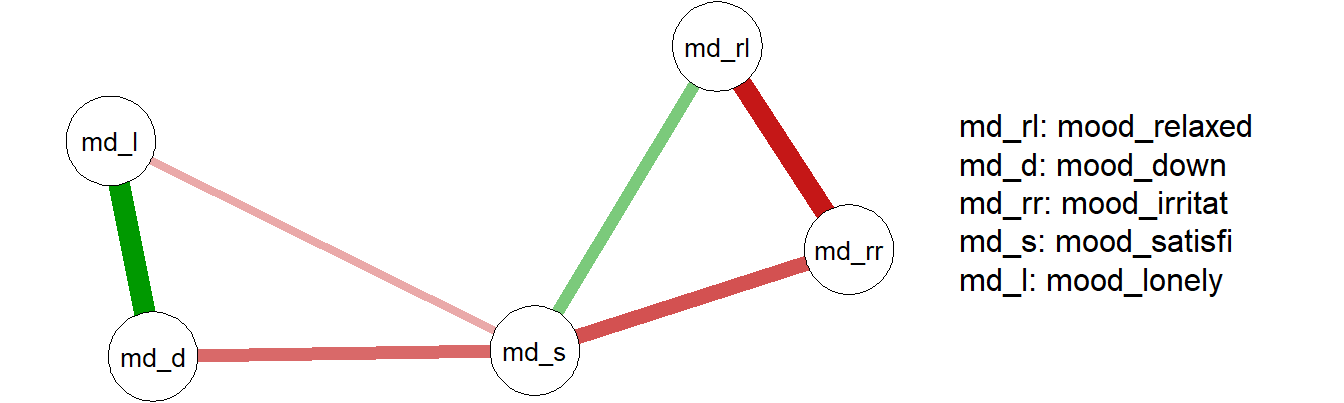
Figure 12.5: Network of mood items from CSD data set
Package qgraph also provides functions to analyze qualities of fitted networks, such as the centrality of nodes in the network. In the network plot above, node md_s appears to be a central node in the network. This is confirmed by calling centralityPlot:
centralityPlot(g)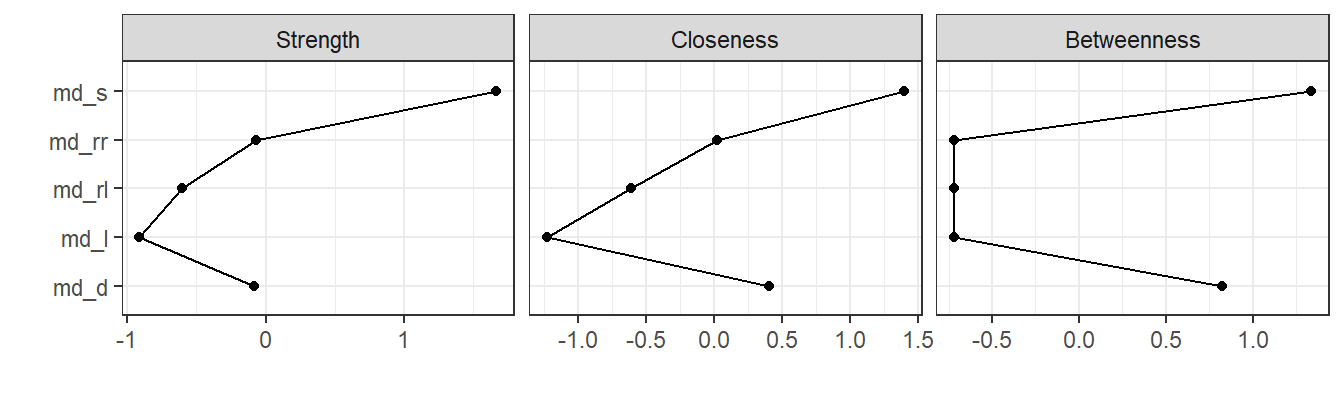
12.6.2 bootnet
In the interpretation of fitted networks, it is important to take the stability of the network into account. Intuitively, networks that are fit on small sample data sets will be less stable than networks based on large data sets. One solution is to asses this is to fit a large number of networks on subsets of the original data, via bootstrapping. In stable networks, the variability of edge estimations and other characteristics will be small, while in unstable networks, the variance will be large. This idea is implemented in package bootnet (Epskamp, Borsboom, & Fried, 2018).
Below, the stability of the network that was fit in the previous example is examined with bootnet: fifty networks are fit, based on fifty bootstrapped samples. In the results plot, the red line marks the strength of the edges in the full sample, while grey confidence intervals mark the distribution of the edge weights in the bootstraps.
# A bootstrapped network.
library(bootnet)

g <- estimateNetwork(d, default = "EBICglasso",
                     corArgs = list(detectOrdinal = FALSE))
results <- bootnet(g, nBoots = 50, verbose = FALSE)
plot(results, order = "mean")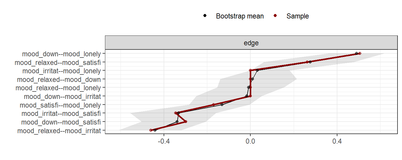
12.7 Timeseries analysis
12.7.1 lomb
Disturbances in circadian rhythms have been related to depressive symptoms (see, e.g., Saeb et al., 2015). With so-called periodograms, these circadian rhythms can be detected in EMA data (see Chapter 7). Standard analysis techniques, however, expect regular time-series, in which data are sampled at equidistant intervals. EMA data, typically, are not equidistant. One solution to this problem is to use the Lomb-Scargle periodogram procedure (Lomb, 1976), which can be applied to unevenly-sampled time-series as well. Package lomb (Ruf, 1999) implements this procedure.
# Calculating a Lomb-Scargle periodogram.
data(ibex, package = "lomb")
lomb::lsp(ibex[2:3]) 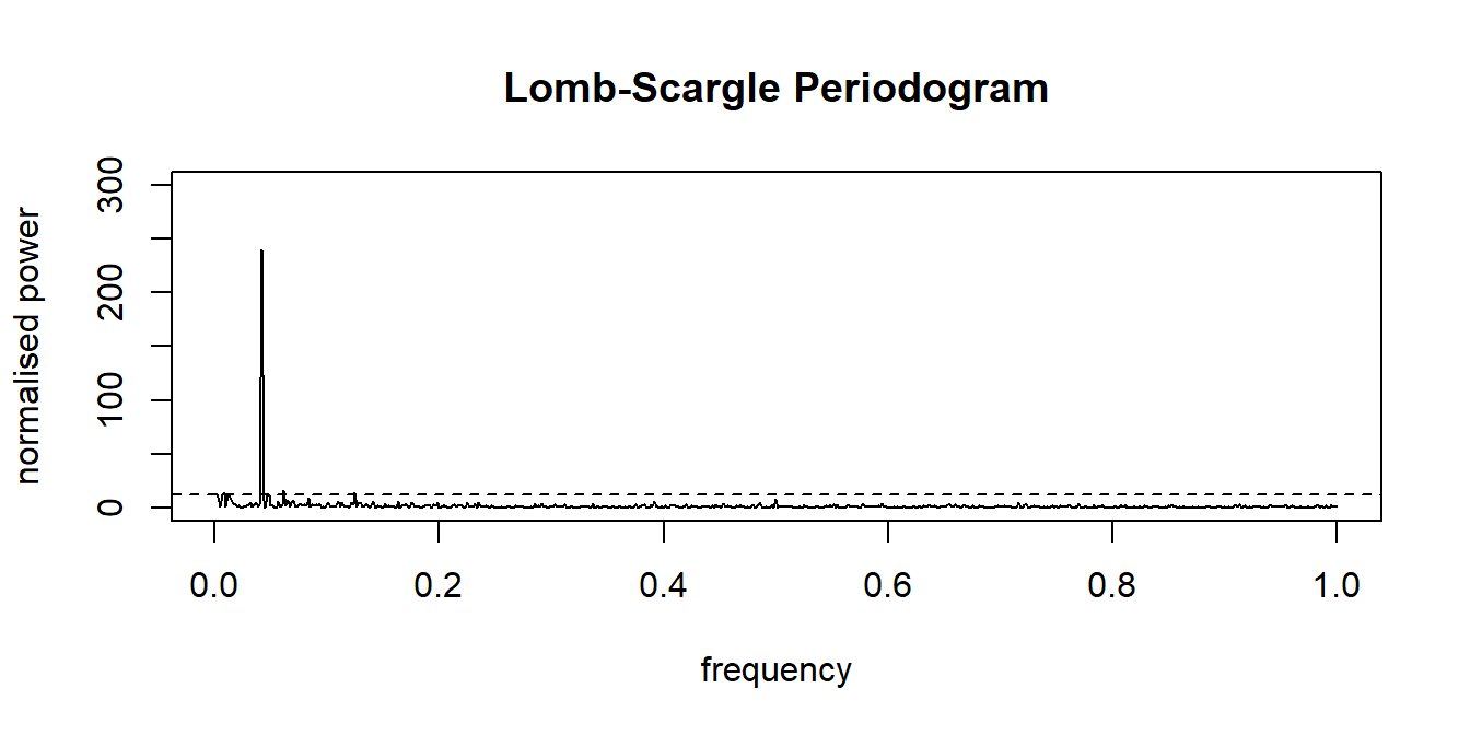
References
Fang, Z., Langford, J., & Sweetland, C. (2018). GENEAread: Read GENEA binary files. Retrieved from https://CRAN.R-project.org/package=GENEAread
Van Hees, V. T., Fang, Z., Zhao, J. H., Heywood, J., Mirkes, E., Sabia, S., & Migueles, J. H. (2018). GGIR: Raw accelerometer data analysis. https://doi.org/10.5281/zenodo.1051064
Choi, L., Beck, C., Liu, Z., Matthews, C. E., & Buchowski, M. S. (2018). PhysicalActivity: Process accelerometer data for physical activity measurement. Retrieved from https://CRAN.R-project.org/package=PhysicalActivity
Emerencia, A. C. (2018). AutovarCore: Automated vector autoregression models and networks. Retrieved from https://CRAN.R-project.org/package=autovarCore
Emerencia, A. C., Van der Krieke, L., Bos, E. H., De Jonge, P., Petkov, N., & Aiello, M. (2016). Automating vector autoregression on electronic patient diary data. IEEE Journal of Biomedical and Health Informatics. https://doi.org/10.1109/JBHI.2015.2402280
Van der Krieke, L., Emerencia, A. C., Bos, H. E., Rosmalen, G. J., Riese, H., Aiello, M., … de Jonge, P. (2015). Ecological momentary assessments and automated time series analysis to promote tailored health care: A proof-of-principle study. JMIR Research Protocols, 4(3), e100. https://doi.org/10.2196/resprot.4000
Wickham, H., François, R., Henry, L., & Müller, K. (2018). Dplyr: A grammar of data manipulation. Retrieved from https://CRAN.R-project.org/package=dplyr
Wickham, H., & Grolemund, G. (2016). R for data science: Import, tidy, transform, visualize, and model data. “ O’Reilly Media, Inc.”
Wickham, H. (2016). Ggplot2: Elegant graphics for data analysis. Springer. https://doi.org/10.1007/978-0-387-98141-3
Wilkinson, L. (2006). The grammar of graphics. Springer Science & Business Media.
Wickham, H., & Miller, E. (2018). Haven: Import and export ’SPSS’, ’Stata’ and ’SAS’ files. Retrieved from https://CRAN.R-project.org/package=haven
Grolemund, G., & Wickham, H. (2011). Dates and times made easy with lubridate. Journal of Statistical Software, 40(3), 1–25. Retrieved from http://www.jstatsoft.org/v40/i03/
Pinheiro, J., Bates, D., DebRoy, S., Sarkar, D., & R Core Team. (2018). nlme: Linear and nonlinear mixed effects models. Retrieved from https://CRAN.R-project.org/package=nlme
Bates, D., Mächler, M., Bolker, B., & Walker, S. (2015). Fitting inear mixed-effects models using lme4. Journal of Statistical Software, 67(1), 1–48. https://doi.org/10.18637/jss.v067.i01
Green, P., & MacLeod, C. J. (2016). Simr: An R package for power analysis of generalised linear mixed models by simulation. Methods in Ecology and Evolution, 7(4), 493–498. https://doi.org/10.1111/2041-210X.12504
Borsboom, D. (2017). A network theory of mental disorders. World Psychiatry. https://doi.org/10.1002/wps.20375
Borsboom, D., & Cramer, A. O. J. (2013). Network analysis: An integrative approach to the structure of psychopathology. Annual Review of Clinical Psychology, 9(1), 91–121. https://doi.org/doi:10.1146/annurev-clinpsy-050212-185608
Bringmann, L. F., Lemmens, L. H., Huibers, M. J., Borsboom, D., & Tuerlinckx, F. (2015). Revealing the dynamic network structure of the Beck Depression Inventory-II. Psychological Medicine. https://doi.org/10.1017/S0033291714001809
Epskamp, S., Cramer, A. O. J., Waldorp, L. J., Schmittmann, V. D., & Borsboom, D. (2012). Qgraph: Network visualizations of relationships in psychometric data. Journal of Statistical Software, 48(4), 1–18. https://doi.org/10.18637/jss.v048.i04
Epskamp, S., Borsboom, D., & Fried, E. I. (2018). Estimating psychological networks and their accuracy: A tutorial paper. Behavior Research Methods, 50(1), 195–212. https://doi.org/10.3758/s13428-017-0862-1
Saeb, S., Zhang, M., Karr, C. J., Schueller, S. M., Corden, M. E., Kording, K. P., & Mohr, D. C. (2015). Mobile phone sensor correlates of depressive symptom severity in daily-life behavior: An exploratory study. Journal of Medical Internet Research, 17(7). https://doi.org/10.2196/jmir.4273
Lomb, N. R. (1976). Least-squares frequency analysis of unequally spaced data. Astrophysics and Space Science. https://doi.org/10.1007/BF00648343
Ruf, T. (1999). The lomb-scargle periodogram in biological rhythm research: Analysis of incomplete and unequally spaced time-series. Biological Rhythm Research, 30, 178–201. https://doi.org/10.1076/brhm.30.2.178.1422