Chapter 7 Feature Extraction
EMA data are streams: time-series that represent processes which may span hours, days, weeks or even months. To the beginning EMA researcher, it may not be immediately clear how to deal with these data. How, for example, can these series be summarized to study differences between individuals or changes within individuals over time? What ‘qualities’ or ‘features’ of a time-series should be considered? What are the available options? In this chapter, we will discuss some of the features that can be extracted from EMA time-series.
7.1 Simulated EMA Time-series Example
We will focus on a simulated three-week time-series of EMA mood responses of a single person, in which ratings were collected five times per day (using the generate_features_dataset function of package emaph). Figure 7.1 shows a plot of the simulated scores.
Stare at the figure for a moment. How would you characterize the development of scores over time? What features would you want to extract? How would you quantify these features?
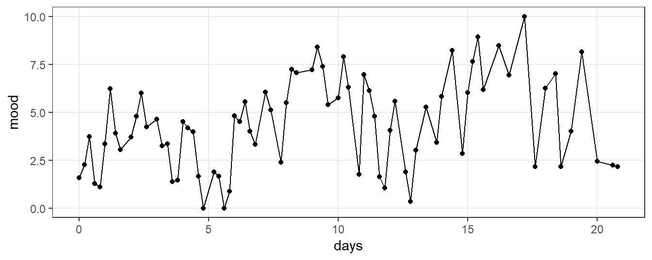
Figure 7.1: A simulated three-week time-series of EMA mood ratings.
7.2 Central Tendency and Variability
Features do not necessarily have to be complex. Familiar measures of central tendency of EMA time-series, such as the mode or the mean, can be useful predictors of traditional clinical assessments. Standard measures of the variability of EMA scores, such as the standard deviation (SD), have been shown to have diagnostic value (see, e.g., R. Bowen, Baetz, Hawkes, & Bowen, 2006). You should not hesitate to consider these statistics when they help you to answer your research question.
You should check, though, whether the implicit assumptions behind the statistics are correct. When you use the mean and the standard deviation to summarize a time-series, you assume that the data-generating process behind the series is stable over time - in technical terms: that this process is stationary (Wikipedia, 2018). If this assumption is incorrect (i.e., if the process is unstable or non-stationary), the mean and SD are biased statistics.
Our simulated EMA time-series is non-stationary, as can be seen in Figure 7.2. We observe a trend: the mood of the person increases over time. EMA scores tend to be below the mean in the beginning, and above the mean at the end. The overall mean (M = 4.4) overestimates the EMA scores of the first week (M = 3.3), and underestimates the scores of the last week (M = 5.5). If you use the overall mean as a feature of the time-series in your analyses, you ignore the mood improvements over the three-week period. In clinical research, you would probably not want to miss this other important feature.
When a trend exists in a series, the overall standard deviation is overestimated, because of the extra variability that is introduced by the changes of the mean. This can be checked by comparing the SD of the full series to the SD of smaller parts. In our example, the overall SD is 2.4. If we calculate the average of the SD of scores of each day, however, the estimated SD is 1.8. If the additional variability introduced by the trend is cancelled out, our estimate of variability decreases considerably.
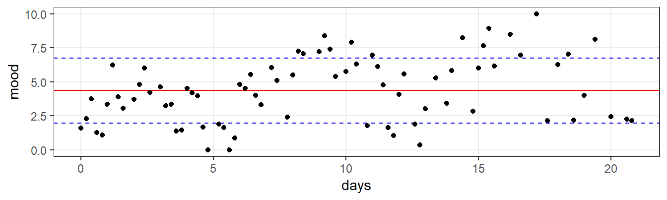
Figure 7.2: EMA time-series, with reference lines for the mean (red line) and the mean +/- 1 standard deviation range (the area between the two blue lines). Both statistics are informative, but obviously do not do full justice to the variation in observations over time.
7.3 Modeling the Trend
Now that we know that the overall mean and SD are sub-optimal features of this time-series, the question is how we can do better. What other features can we extract? One option would be to characterize the series in simple regression terms, via an intercept and a slope. By doing so, we can economically describe the dynamics of the series with two numbers. As can be seen in Figure 7.3, the regression model provides a more realistic and informative summary. At the start, the estimated mean - the intercept - is 3.2. This mean increases approximately 0.9 points per week (the slope), to a final estimated mean of 5.9. If you visually compare the red regression line in Figure 7.3 with the red line for the mean in 7.2, it is clear the regression line provides a much better summary.
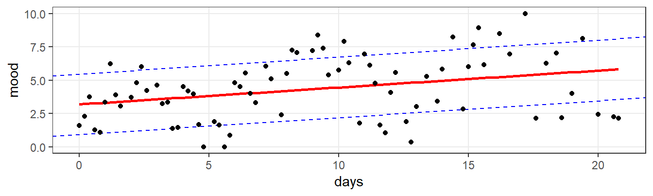
Figure 7.3: EMA time-series, with a regression reference line (red) and the residual error SD range around this line (the area between the two blue lines).
By using regression, we can also find a better estimate of the SD. Remember how the SD is conceptually defined as the average distance between the scores and the mean. Since the mean is modeled by the regression line, we can estimate the SD by calculating the standard deviation of the residuals of the regression model that we used to retrieve the intercept and slope. For our series, this results in an estimated SD of 2.3. The new SD estimate is smaller than the overall SD, as expected. By accounting for the extra variability introduced by the trend, we get a more accurate estimate of the variability around the mean at each point in time. However, the new estimate is still higher than the daily estimate that we calculated above. Figure 7.4 provides a first indication of what is going on. In the figure, absolution regression residuals are plotted over time, with a regression line superposed. This reveals that residuals increase as time goes by. We discovered a new feature of the series: heteroscedasticity.
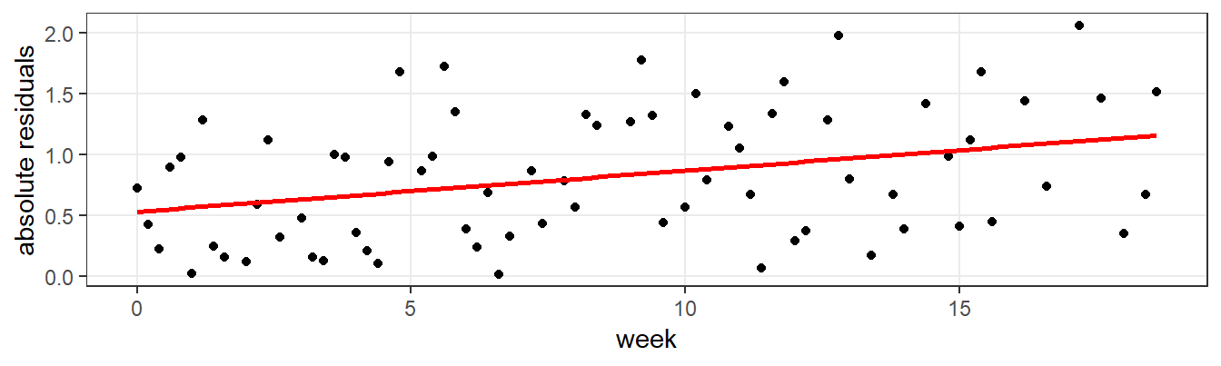
Figure 7.4: Plot of absolute regression residuals over time, revealing heteroscedasticity.
7.4 Missing Values
In EMA research, you should be prepared to deal with missing values. Especially with active EMA, in which participants have to consciously respond to prompted questions several times a day, non-response is inevitable. Missing values are typically considered to be a nuisance rather than a feature of EMA time-series. Non-response, however, is an important characteristic, that may even have clinical relevance. Missing values are also present in our simulated EMA time-series example, as you may have found out already when you inspected Figure 7.1. The points, denoting the observed responses, are denser in the beginning of the series. Over the course of the study period, the probability of missed ratings increases. This becomes immediately clear from Figure 7.5, in which the percentage of missed ratings is plotted per day. Every week, the probability of missed ratings increases approximately 16%.
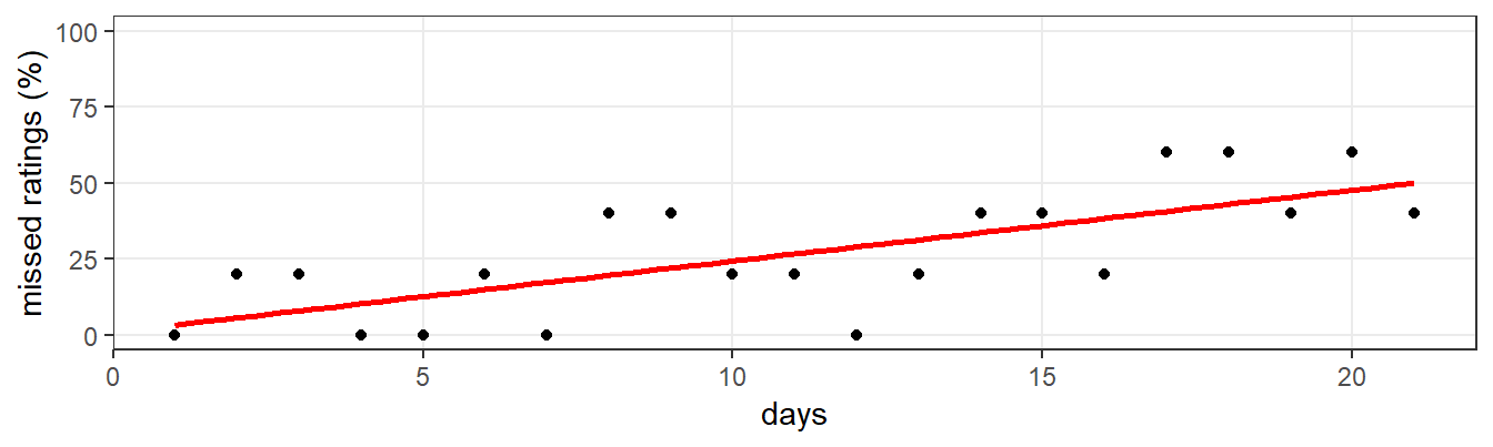
Figure 7.5: Percentage of missed mood ratings, per day, over the three-week study period, with a regression line (red) superposed, revealing a familiar trend in EMA data.
Now that we now about these missing values, the question arises how to deal with them? You can choose to ignore the missing values (assuming that the occurrence of missing values was driven by a completely random process). Alternatively, you could try to replace the missing values with plausible values (in which case it becomes important to think about the process that drives the missingness). If you decide to impute, there are several options. For example, you can replace missing values with the mean, the last-known value, an interpolated value or with a smoothing technique such as the Kalman-filter (see Hoogendoorn & Funk, 2017, for a discussion). Figure 7.6 illustrates the linear interpolation approach: missing values (marked by red dots) are replaced by values that lie between the non-missings. Imagine that we would have used the mean to impute. Can you see why that would have disrupted local patterns in the series?
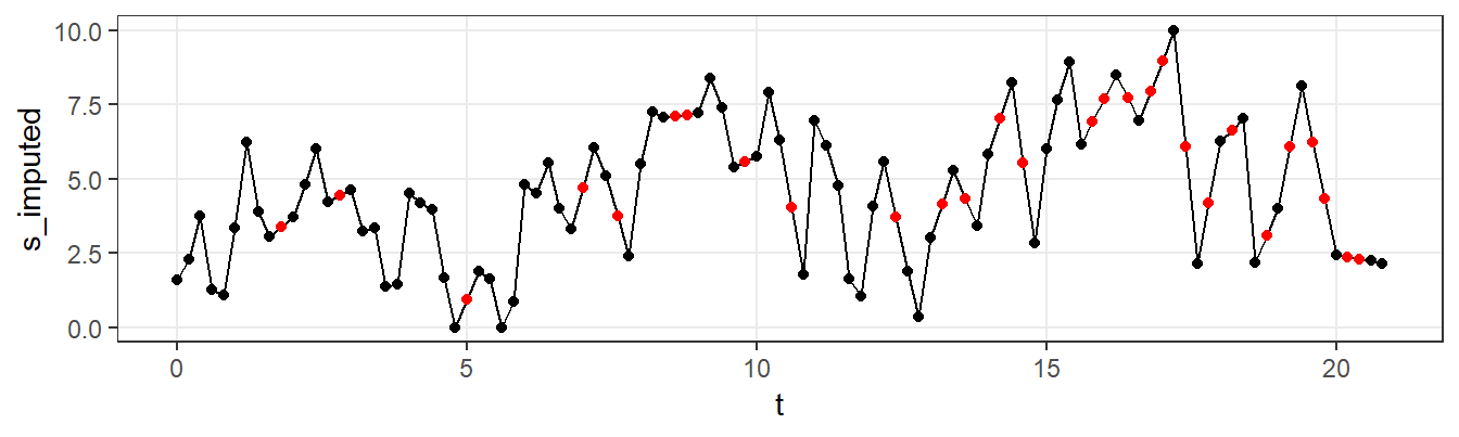
Figure 7.6: EMA time series, with missing values (red) imputed through interpolation.
7.5 Auto-correlation
When a series is correlated with delayed copies of itself, we say that it is auto-correlated. In repeated measurements of natural phenomena, this auto-correlation can often be found. The temperature of today is correlated with the temperature of recent days. Similarly, EMA mood ratings, taken at time t, are typically correlated with ratings taken at t-1, t-2, etc. Studying the auto-correlation of a time-series at different delays can be very revealing, as illustrated by the auto-correlation plot in Figure 7.7, in which the correlation of the EMA series with itself is plotted, for various delays (or ‘lags’ as these delays are called). First, the plot reveals that observations are correlated with previous values at lag 1: this series is auto-correlated. Second, there appears to be a pattern in the correlations at later lags: positive and negative correlations alternate, in a pattern that seems to reflect periodicity.
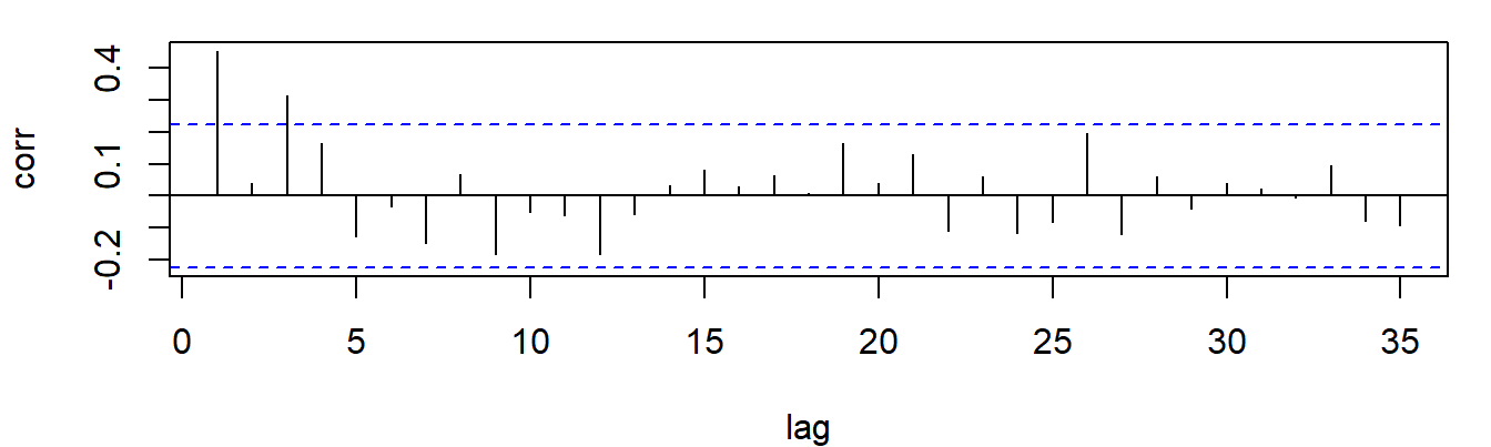
Figure 7.7: Autocorrelation plot of the EMA mood series, revealing periodicity.
7.6 Rolling Statistics
From the auto-correlation analysis, we learned that describing the EMA series as a simple trend might be too simplistic. The mean does not increase in a simple linear fashion. There seem to be periodic components in the series as well: the signal appears also to be characterized by a series of increases and decreases in the mean mood level. In the plot of the raw series, this is not immediately clear. However, if we “smooth” the series, by calculating the mean as it develops over time, the periodicity in the series is becoming clearer. Figure 7.8 illustrates this.
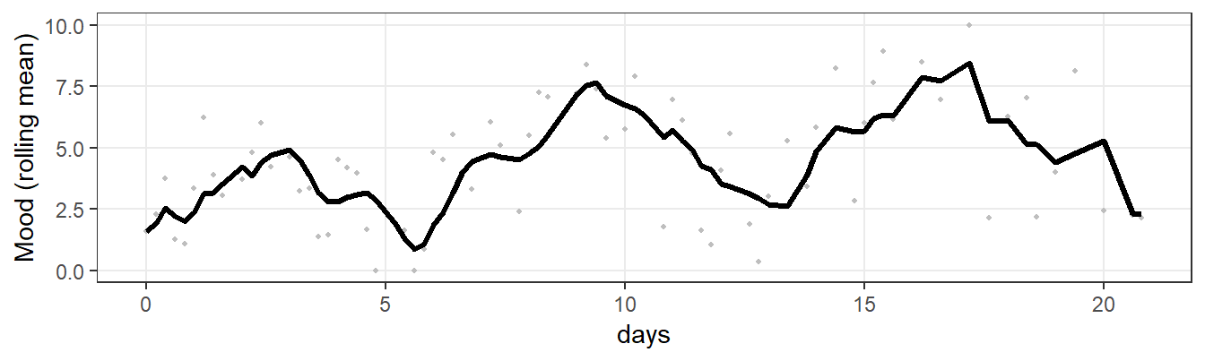
Figure 7.8: EMA mood series, with a rolling mean superposed.
7.7 Periodicity
Both the auto-correlation analysis and the moving average plot suggest periodicity in the EMA time series. Suppose we want to know more about this periodicity. Is there a way to quantify it? Yes, there is. With a technique called Fourier Analysis, the strength (‘power’) of the evidence for the presence of various frequencies can be quantified. Figure 7.9 shows what happens if we run a Fourier analysis of our time series (with R’s built-in function spec.pgram).
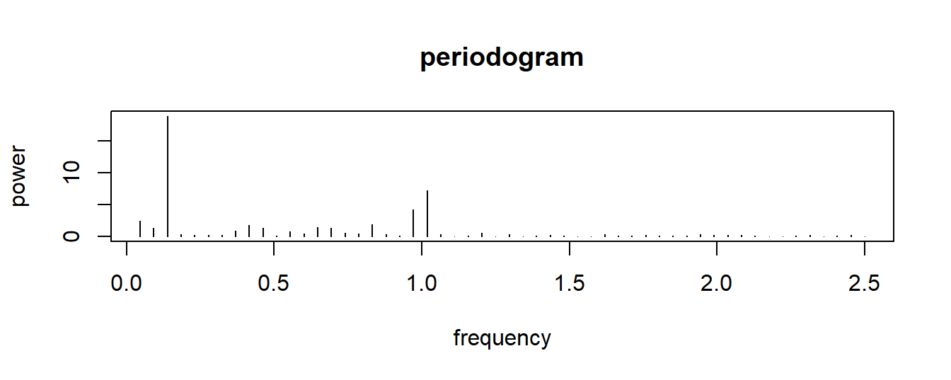
Figure 7.9: periodogram of the EMA time series, revealing a one-day and a one-week period.
There are two peaks in the figure: at a frequency of 1 (day) and at a frequency of 0.14 (about one week). This series is circadian: mood ratings follow a daily and a weekly pattern. This is a common feature of EMA data, because of the circadian rhythms in our body and in our environment (our biological clocks, day-night cycles, seasons) (Doherty, 2018; Frank, Swartz, & Boland, 2007; Frank, Swartz, & Kupfer, 2000; Karatsoreos, 2014; Tahmasian et al., 2013; Van Someren, 2000).
7.8 Discussion
In this chapter, we used a number of statistical indicators to characterize a single time-series. By extracting these indicators (or “features”), we identified several regularities. We learned that the mean, variance and missingness increased over time, and we identified clear signs of circadian rhythmicity.
You might have identified some of the features when you first inspected Figure 7.1. The increase in the mean was pretty easy to spot. However, the systematic increases in the variance and the missingness were less clear. Likewise, although you might have spotted the periodicity in the series, the circadian components were probably too subtle to spot for the naked eye.
The aim of the chapter was to illustrate the options available to the EMA researcher to quantitatively summarize EMA series. Other options, of course, exist. In chapter 9, for example, we will see how subtle changes in variation and auto-correlation in EMA mood scores can be summarized in a single dynamic statistical feature that may be predictive indicator of significant future state changes.
Finally, you might have been disappointed by the lack of code examples in this chapter. We did not include them, to avoid unnecessary distraction from the conceptual explanation. Instead, we provide a full code listing below, to allow you learn how to apply the feature extraction techniques yourself.
# (De)constructing a simulated EMA time-series ------------

# libraries -----------------------------------------------
library(ggplot2)
library(gridExtra)
library(psych)
library(zoo)
library(emaph)

# simulate the signal (using emaph function) --------------
d <- generate_features_dataset(seed = 123)

# plot ----------------------------------------------------
e <- subset(d,!is.na(s))
ggplot(e, aes(x = t, y = s)) +
  geom_line() +
  geom_point() +
  ylab("mood") + xlab("days") +
  ylim(0, 10) +
  theme_bw() + theme(panel.grid.minor = element_blank())


# plot, with mean and variance ----------------------------
ggplot(e, aes(x = t, y = s)) +
  geom_hline(yintercept = mean(e$s, na.rm = TRUE),
             color = "red") +
  geom_hline(
    yintercept = mean(e$s, na.rm = TRUE) + sd(e$s,
                                              na.rm = TRUE),
    color = "blue",
    linetype = 2
  ) +
  geom_hline(
    yintercept = mean(e$s, na.rm = TRUE) - sd(e$s,
                                              na.rm = TRUE),
    color = "blue",
    linetype = 2
  ) +
  geom_point() +
  ylab("mood") + xlab("days") +
  ylim(0, 10) +
  theme_bw() + theme(panel.grid.minor = element_blank())


# The trends ----------------------------------------------

# run a linear regression of mood ratings by time
fm = lm(s ~ t, e)

# mean
ggplot(e, aes(x = t, y = s)) +
  geom_smooth(method = "lm", color = "red", se = FALSE) +
  geom_abline(
    intercept = coef(fm)[1] + sd(resid(fm)),
    slope = coef(fm)[2],
    color = "blue",
    linetype = 2
  ) +
  geom_abline(
    intercept = coef(fm)[1] - sd(resid(fm)),
    slope = coef(fm)[2],
    color = "blue",
    linetype = 2
  ) +
  geom_point() +
  ylab("mood") + xlab("days") +
  ylim(0, 10) +
  theme_bw() + theme(panel.grid.minor = element_blank())


# residuals
e$residuals <- rstandard(fm)
e$week <- (e$t %/% 1) + 1

ggplot(subset(e, week < 20), aes(x = t, y = abs(residuals))) +
  geom_point() +
  geom_smooth(method = "lm", color = "red", se = FALSE) +
  ylab("absolute residuals") + xlab("week") +
  theme_bw() + theme(panel.grid.minor = element_blank())


# Missing values ------------------------------------------
d$t_g <- cut(t, 21, labels = 1:21)
p <- prop.table(table(d$t_g, is.na(d$s)), 1)
p <- as.data.frame(p)
p <- subset(p, Var2 == TRUE)
fm2 <- lm(p$Freq ~ as.numeric(p$Var1))

ggplot(p, aes(x = as.numeric(Var1), y = Freq * 100)) +
  geom_smooth(method = "lm", color = "red", se = FALSE) +
  geom_point() +
  ylab("missed ratings (%)") + xlab("days") +
  ylim(0, 100) +
  theme_bw() + theme(panel.grid.minor = element_blank())


# imputation through interpolation
impute_interpolation <- function(x) {
  require(zoo)

  y = zoo(x)

  # fill initial and trailing NA
  if (is.na(y[1]))
    y[1] = y[which.max(!is.na(y))]
  if (is.na(y[length(y)]))
    y[length(y)] = y[max((!is.na(y)) * (1:length(y)))]

  # interpolate
  y_ = as.numeric(na.approx(y))

  y_
}

d$s_imputed <- impute_interpolation(d$s)
ggplot(d, aes(x = t, y = s_imputed)) +
  geom_line(color = 1) +
  geom_point(aes(color = is.na(s))) +
  scale_color_manual(values = c("black", "red")) +
  guides(color = FALSE) +
  theme_bw() + theme(panel.grid.minor = element_blank())


# Autocorrelation -----------------------------------------
acf(e$s,
    type = "partial",
    lag.max = 35,
    main = "")


# Rolling mean --------------------------------------------
d$rolling_mean <-
  as.numeric(
    zoo::rollapply(
      as.numeric(d$s),
      width = 5,
      FUN = function(x)
        mean(x, na.rm = TRUE),
      fill = NA,
      align = "right",
      partial = TRUE
    )
  )

e <- subset(d,!is.na(s))
ggplot(e, aes(x = t, y = rolling_mean)) +
  geom_point(aes(y = s), color = "grey", size = .8) +
  geom_line(size = 1.2) +
  ylab("Mood (rolling mean)") + xlab("days") +
  ylim(0, 10) +
  theme_bw() + theme(panel.grid.minor = element_blank())


# Frequency analysis --------------------------------------
fa <-
  spec.pgram(
    ts(impute_interpolation(d$s),
       frequency = n_measurements_per_day),
    detrend = TRUE,
    demean = TRUE,
    main = "periodogram",
    sub = "",
    xlab = "frequency",
    log = "no",
    ylab = "power",
    type = "h",
    spans = NULL,
    taper = 0.01,
    ci = FALSE
  )
References
Bowen, R., Baetz, M., Hawkes, J., & Bowen, A. (2006). Mood variability in anxiety disorders. Journal of Affective Disorders, 91(2-3), 165–170. https://doi.org/10.1016/j.jad.2005.12.050
Wikipedia. (2018). Stationary process — Wikipedia, The free encyclopedia. http://en.wikipedia.org/w/index.php?title=Stationary%20process&oldid=866157327.
Hoogendoorn, M., & Funk, B. (2017). Machine learning for the quantified self: On the art of learning from sensory data. Springer International Publishing. Retrieved from https://books.google.nl/books?id=WZs3DwAAQBAJ
Doherty, A. (2018). Circadian rhythms and mental health: wearable sensing at scale. The Lancet Psychiatry. https://doi.org/10.1016/S2215-0366(18)30172-X
Frank, E., Swartz, H. A., & Boland, E. (2007). Interpersonal and social rhythm therapy: An intervention addressing rhythm dysregulation in bipolar disorder. Dialogues in Clinical Neuroscience. https://doi.org/10.1002/jclp.20371
Frank, E., Swartz, H. A., & Kupfer, D. J. (2000). Interpersonal and social rhythm therapy: Managing the chaos of bipolar disorder. Biological Psychiatry. https://doi.org/10.1016/S0006-3223(00)00969-0
Karatsoreos, I. N. (2014). Links between Circadian Rhythms and Psychiatric Disease. Frontiers in Behavioral Neuroscience. https://doi.org/10.3389/fnbeh.2014.00162
Tahmasian, M., Khazaie, H., Golshani, S., & Avis, K. T. (2013). Clinical application of actigraphy in psychotic disorders: A systematic review. Current Psychiatry Reports. https://doi.org/10.1007/s11920-013-0359-2
Van Someren, E. (2000). Circadian rhythms and sleep in human aging. Chronobiology International. https://doi.org/10.1081/CBI-100101046